9 followers
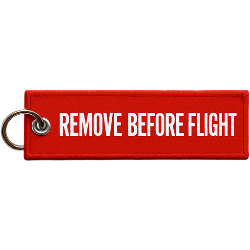
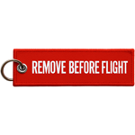
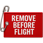
A horizontal red rectangle inflight safety down lock pin with words “remove before flight”