AI Emojis
Download App
AI Emojis
Download App
@elegantknight90759
0 followers
0
•
0
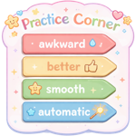
A small “practice corner” sign with steps labeled: awkward → better → smooth → automatic
See More